
5 Tips and Tricks Using Power BI Bookmarks

Bookmarks are one of Power BI’s Most Creative Additions To-Date:
The possibilities and utility that bookmarks add to reports really is impressive. Though this feature is not brand new, it remains an extremely relevant tool and therefore is worth the time required to educate ourselves on the many uses.
Real life examples are excellent for relaying meaning. Therefore, I’m going to show one of my own reports and five unique ways I used bookmarks to enhance the user experience.
A bit of background. This report will seem very cryptic to most of you, but that’s okay. For those who are interested, I have been playing Magic: The Gathering casually and competitively for just about 8 years now. Magic as game is impressive for many reasons including its high versatility, which leaves room for continued learning and endless ways to enjoy the game. My favorite way to play Magic over the last 2 years has been Cube Drafting.
What is Cube Drafting? Drafting in Magic is where players participate in a small tournament without cards from their collection, but rather with surprise booster packs that they open at the beginning. During the drafting process, players choose cards they would like to use and then compete with 8 - 10 people in a Swiss style tournament. When playing a Cube Draft, the only difference is that players will choose cards from a Cube.
A Cube is collection of 360-1000 magic cards that have been specifically chosen by a player to ensure the most enjoyable game play possible. Whether that experience is built around the most powerful cards in Magic, or a random fun theme, that is up to the Cube builder. My Cube contains 450 cards and is meant to provide the most competitive experience possible.
A Bit More About Magic:
Here are some very basics about Magic to help you extract meaning in my report.
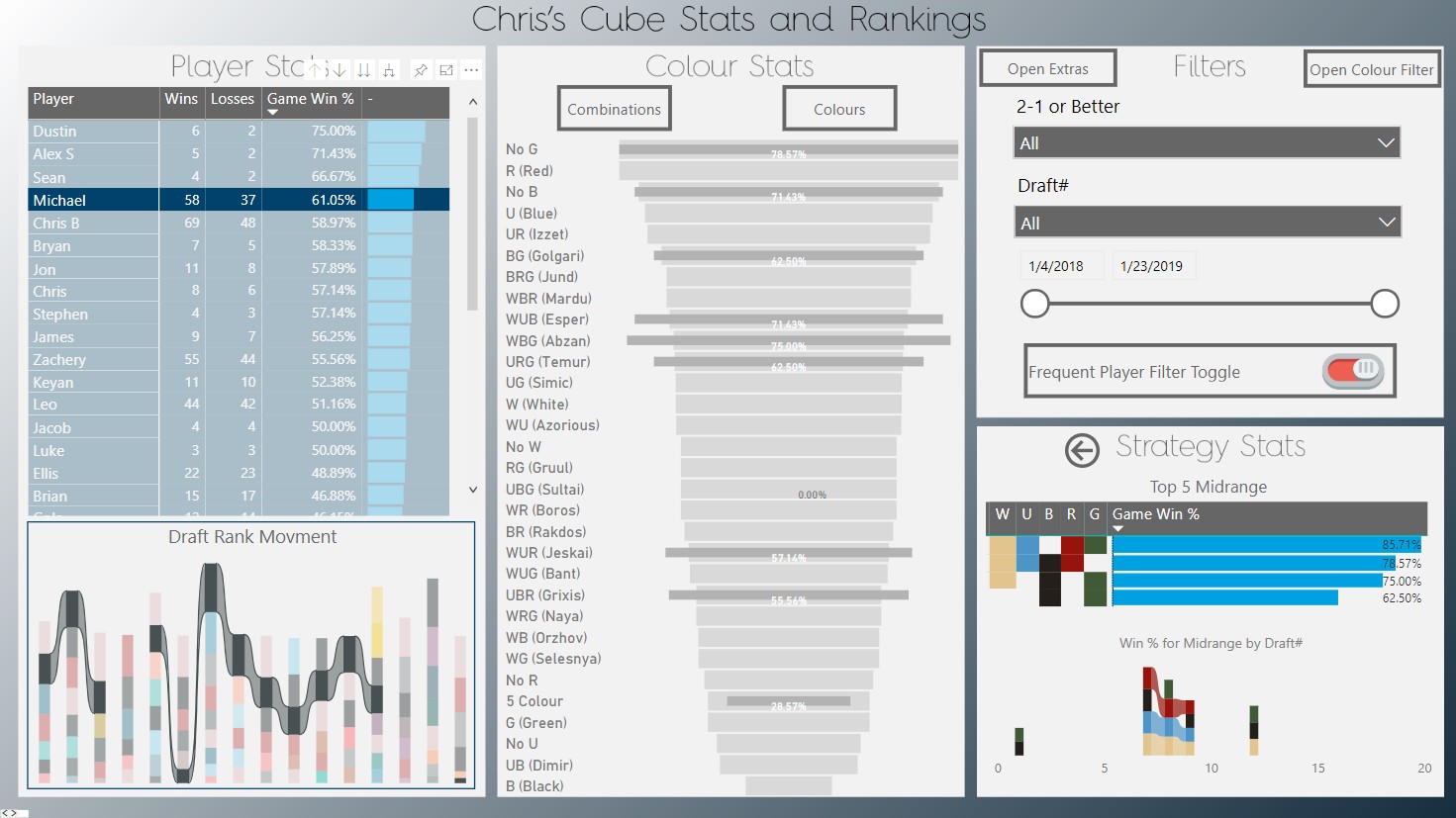
In Magic players battle one vs one using decks made up of the 5 colours including; White (W), Blue (U), Black (B), Red (R) and Green (G). Each colour has dramatically different styles and strategies, and players can mix and match colours for even more variation. It is important for a Cube designer to ensure that each strategy and colour is balanced. Now, here is where my reporting comes in.
I built this report to monitor and understand the strategies behind my Cube (and also record player scores!). Most of the insights hinge around the colours of the Magic decks, and my valuable players.
On to the Bookmarks! How Did I Use Them?

Introductions:
It is quite common for reports to have a “landing page” where the content and purpose of the report is described. We feel the landing page method does not create a user experience, as it only provides basic text. Bookmarks can take your intro beyond text and make it interactive and far more engaging.

Navigation:
I am not a fan of Power BI’s current solution for developing mobile reports. So, I’ve used bookmarks to navigate in a way that creates a better experience for mobile users.

Drilling:
Tool tips and drilling are good for offering underlying insights, though sometimes they don’t do the trick. Often it is important to drill into a category with a tool-tip representation, while still being able to explore and cross-filter between other visuals. Bookmarks can do this quite well.

Compact:
It’s really common for slicers and descriptions to take up way more real estate in your report than necessary. In addition, one can often get stuck with bulky visuals that conflict with others in a report. Bookmarks provide an excellent solution through swapping two or more visuals in one space on a report and creating “drop down menus”. This can save valuable real estate and create a more exiting space for users to explore.

Toggling:
I really dislike slicers with only two options: True/False, On/Off, Yes/No. Bookmarks can create a similar experience with only one button that toggles back and forth, like a light switch. This creates a smooth transition and allows users to focus on the results rather than the slicer itself.
What do These Features Look Like In Practice?
I’ll take some time to show you my results; then you can enjoy exploring them afterward!
5 Tips and Tricks!

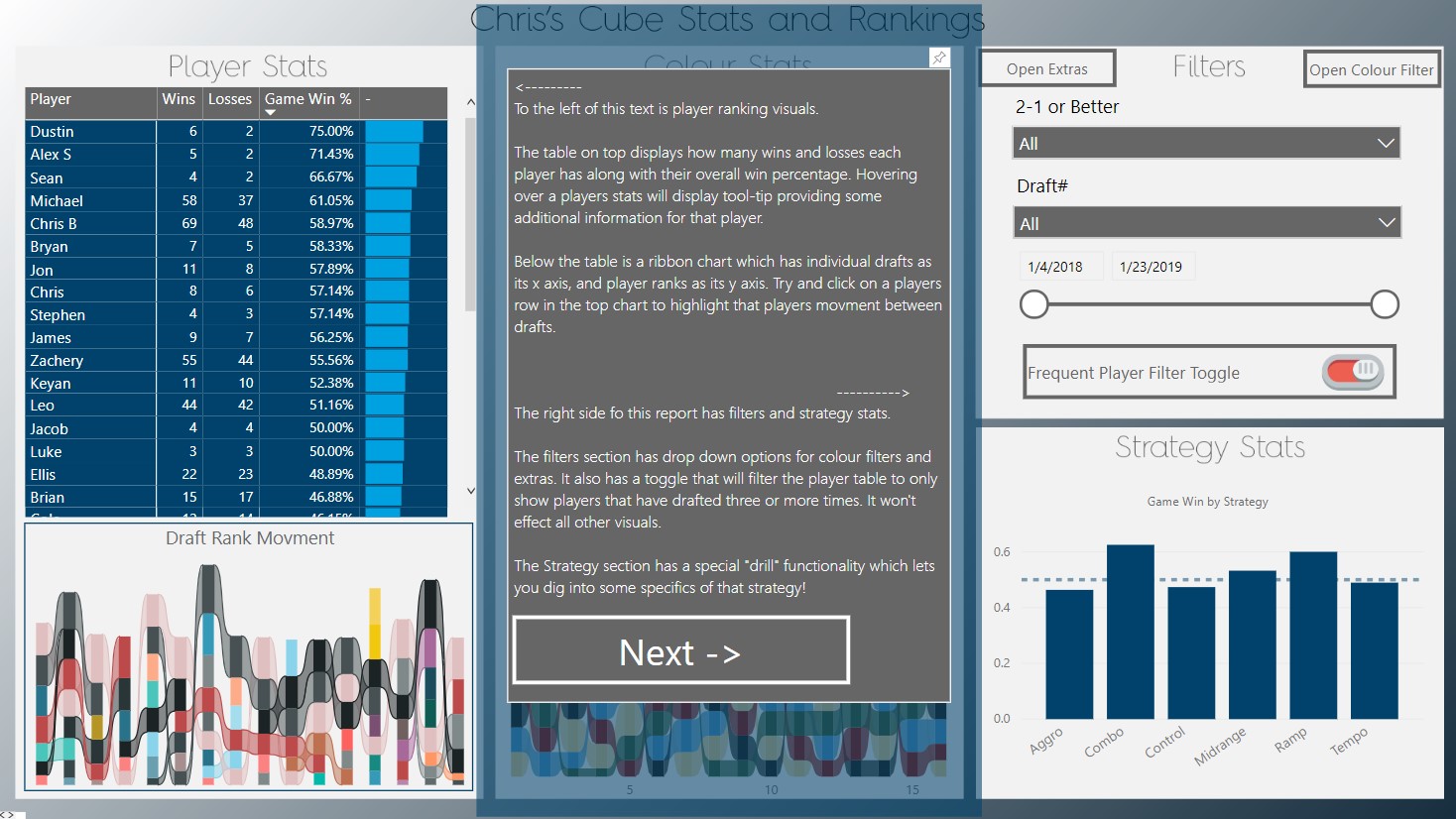
1) Introductions:
Landing page introductions serve their purpose well, however, they do not create the experience that I am looking for.
I’ve used bookmarks to create a three-step introduction, which explains each section separately. This way you can interact as you learn!
There is also a ‘skip tutorial’ option, created using a faded background button.
TIP: Make an easy ‘opt out’ to ensure your readers can skip the tutorial.
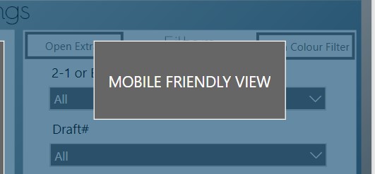
2) Navigation:
My main report does not currently any navigation options. However, you may have noticed the “MOBILE FRIENDLY VIEW” button.
As I previously noted, I am not a fan of mobile development in PowerBI. So, I’ve taken it into my own hands to use bookmarks for this.
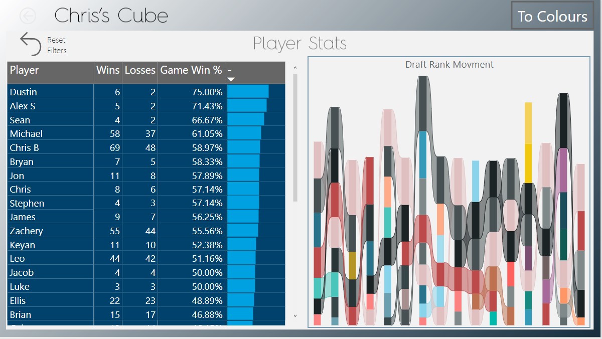
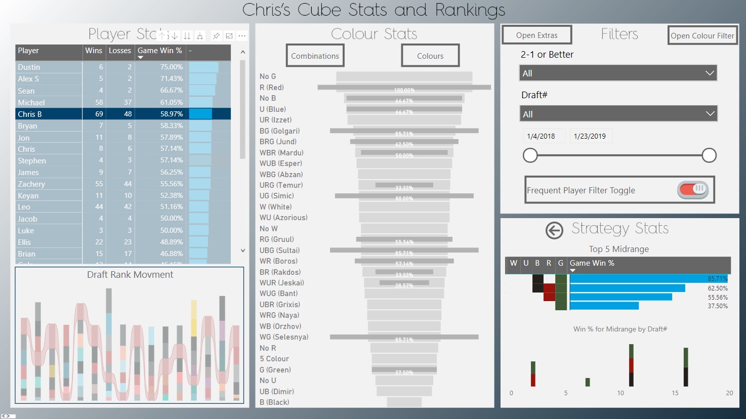
This button takes you to a separate tab, which contains the contents of the left segment called “Player Stats”. There are buttons up top that “slide” your view left and right accordingly.
TIP: The main issue in this mobile approach is the loss of cross filtering between sections. To solve this, I’ve made every dimension ‘drillable’ between sections.
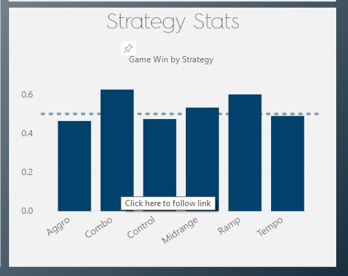
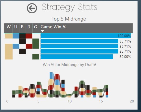
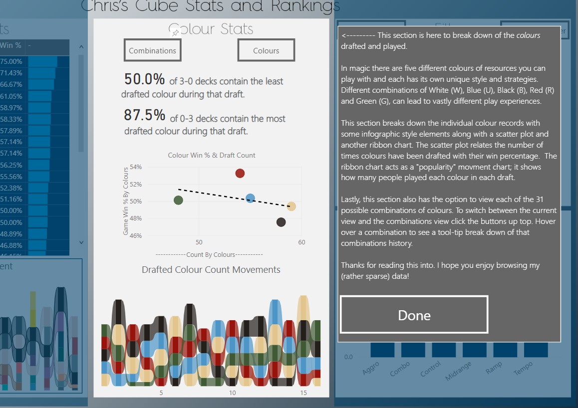
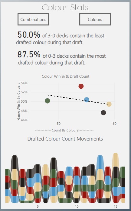
3) Drilling:
There are lots of cases where tool-tips and drill through pages do exactly what you want in a report, but I find this isn’t always the case.
You’ll see in your exploration that I’ve used tool tips quite a bit, though for the Strategy section I was looking for a little more.
I wanted to display a static tool-tip that would allow me to explore other filters.
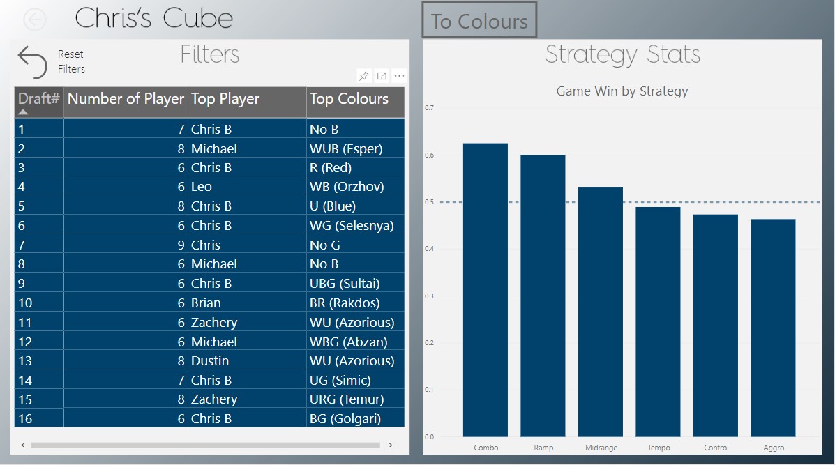
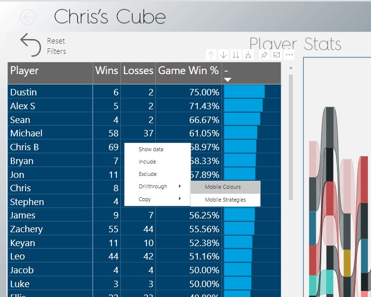
So, I used bookmarks to swap out the visuals and display a break down of the chosen category.
TIP: If you try this, you will be layering static buttons over a visual. Be very careful that you won’t lose columns to cross-filtering or slicers! To avoid this I’ve slightly skewed the game win % calculation in my initial chart so that it is never zero.
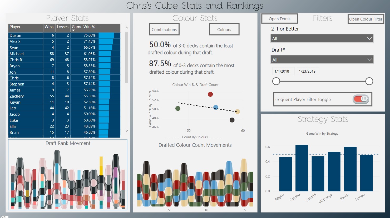
4) Compact:
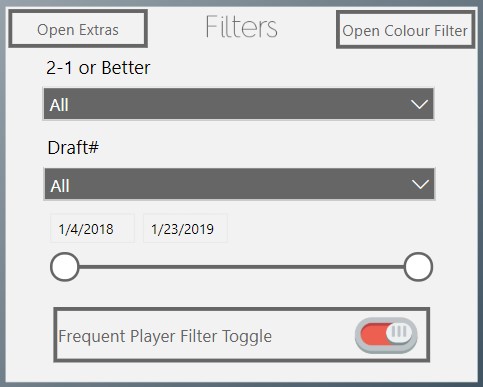
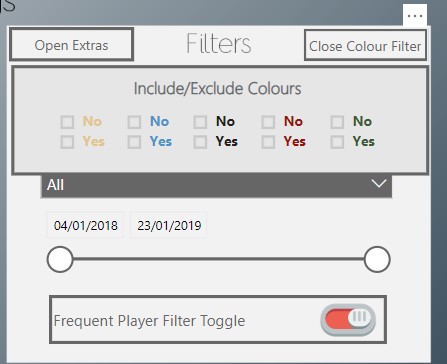
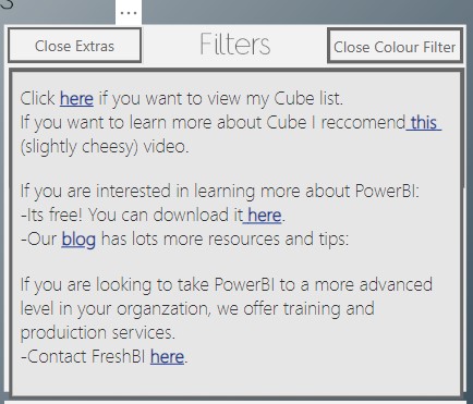
My slicers already take up a hefty portion of my report, yet I still wanted more…. Bookmarks were the best solution to creating some additional space!
In the top right of the filters section, there is a button with a small drop down and a few extra slicers. To the left, there is another “drop down” with some links and resources.
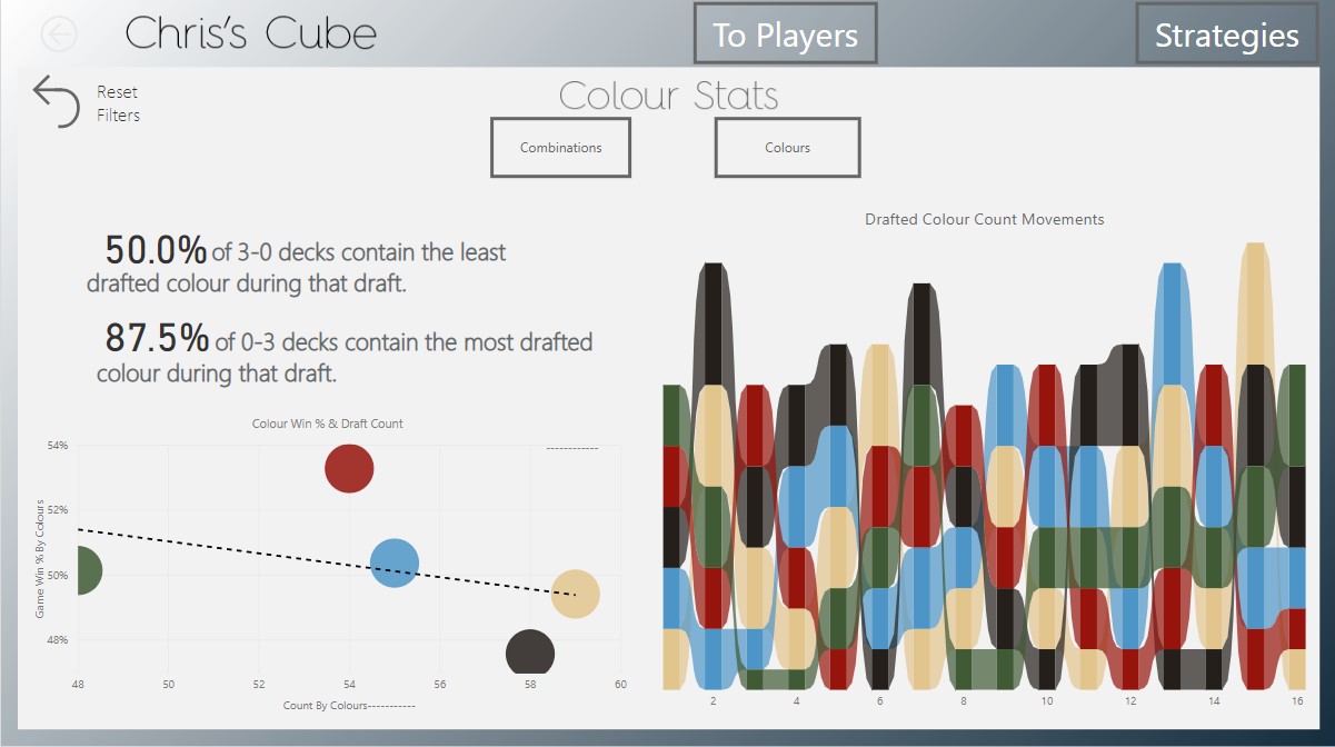
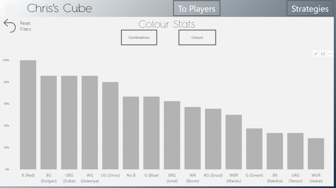
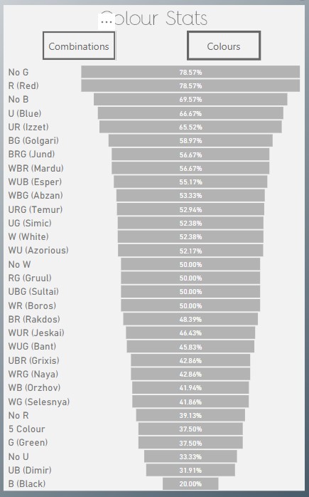
I implemented another compacting feature in this report, which was accomplished by swapping visuals. This works by switching between the “Combination” and “Colour” buttons in the center section. This helps mitigate the combinations visual taking up SO MUCH space…
Tip: Make sure you disable the Data effecting portion of your bookmark, or else you’ll revert all your slicers after you close the drop down. (this applies to most navigation bookmarks!)

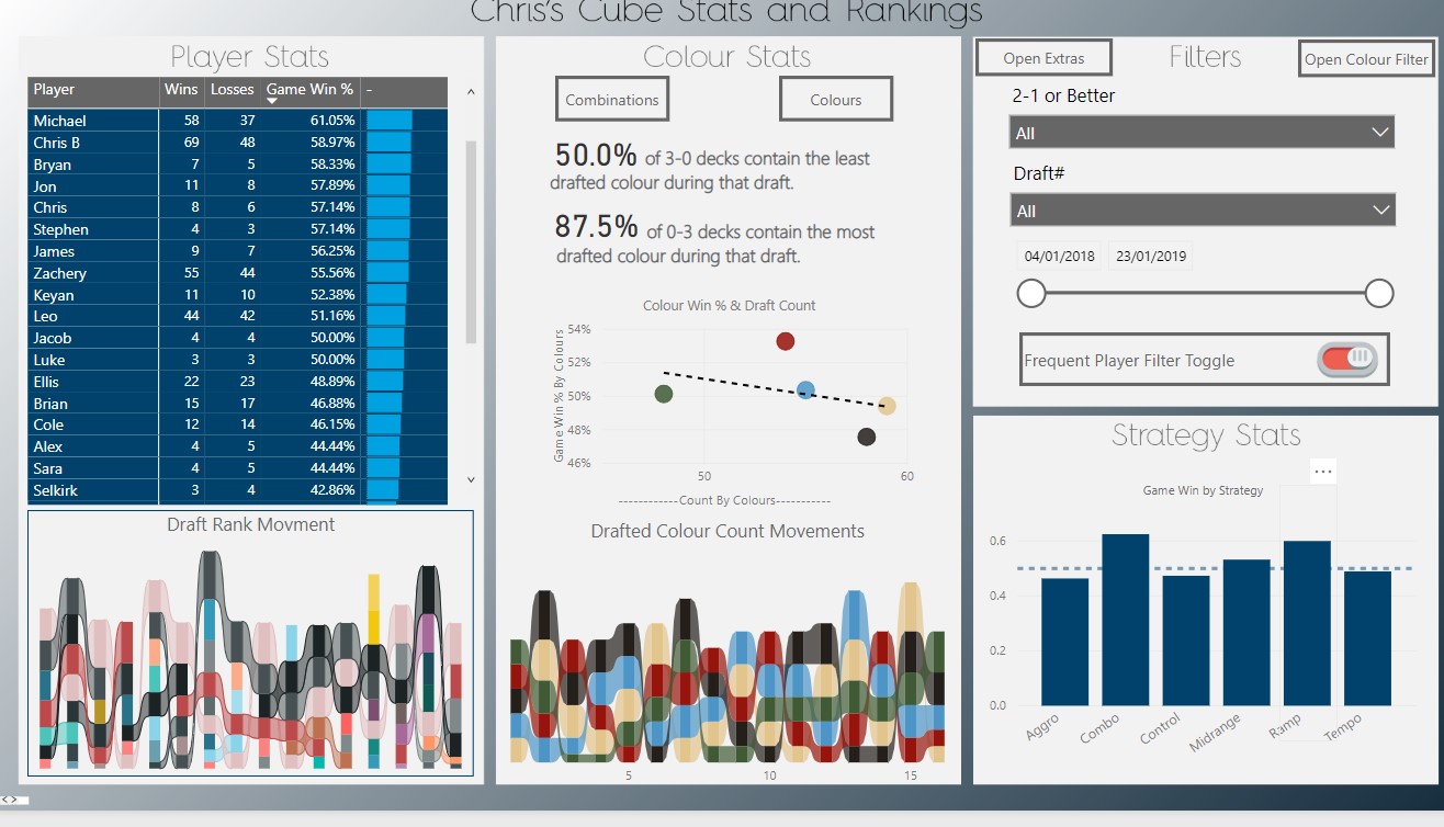
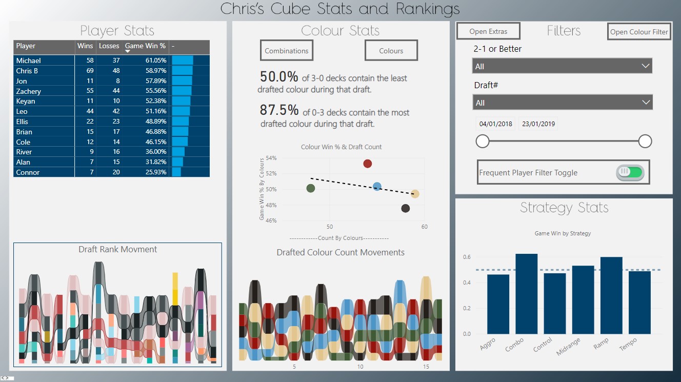
5) Toggling:
I have never liked binary slicers. So I’ve used a pair of bookmarks and images to create a toggle feature that will enable and disable a “Frequent Players” filter on the Player Stats table.
TIP: Use images to make it more clear what selection your toggle is on.
Time for a Test Drive!
That is all of the features I have to show you for today. Now take some time to explore it for yourself and see what you can find!
Our Latest Blogs


About FreshBI
Based in Canada, South Africa and in the United Kingdom, we have helped hundreds of businesses achieve excellence & success through business intelligence.
Power BI runs in our blood, and we are ready to take your business to next level.