A waterfall chart in Power BI is an excellent way to visualize appreciation or depreciation in a value as quantities are added or subtracted from it. These charts are particularly useful for illustrating the flow and impact of values as they accumulate over a series of data points, especially to visualize financial data, such as profit and loss statements or budget breakdowns.
Beyond the traditional use of a waterfall, we can further enhance its utility by integrating it into other visual elements. For instance, it could be incorporated within the structure provided by a matrix holding a financial statement to present the information in a more visually engaging manner. This integration would be achieved through implementing SVGs (Scalable Vector Graphics).
SVG is a vector-based image format, which means that graphics can be scaled to any size without losing quality. This is especially important in Power BI, where reports may be viewed on different devices with varying screen sizes.
Once set up, elements can be manipulated based on data values, enabling dynamic and data-driven visualizations.
Once you have the data, you need to add a table visual. The steps involved are:
- From the “Visualizations” pane, select the “Table” icon to add a table visual.
- Drag your category column and the newly created “SVG Code” column into the “Values” field well.
- In the “Visualizations” pane, click on the table visual to select it.
- In the “Fields” pane, click on the dropdown arrow for the “Values” field and select “Don’t summarize” for both columns.
- Resize and format the table as needed, removing unnecessary columns.
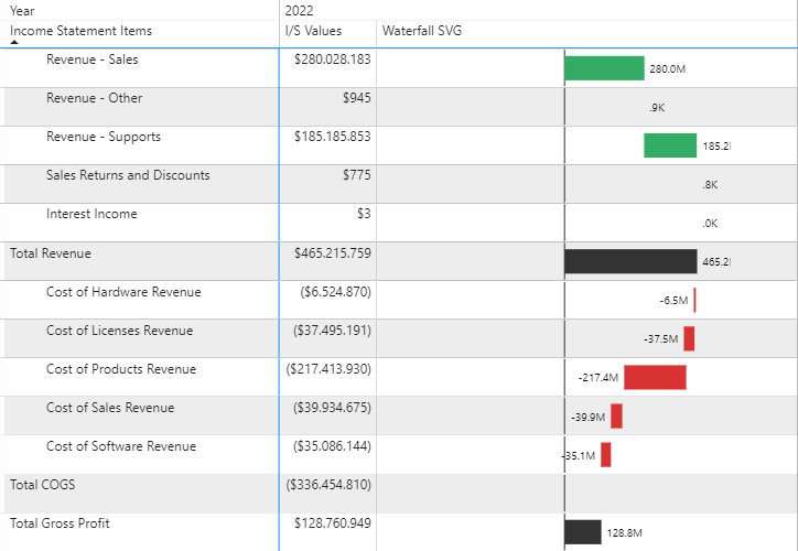
For this example, we’d be rendering the SVG images inside of the table in Power BI like the following:
How do we achieve this? We do this right inside DAX! We can dynamically model and generate our SVGs, specifying every characteristic such as color, shape, position, size, etc. The SVG generated will be rendered in our table by simply incorporating the measure.

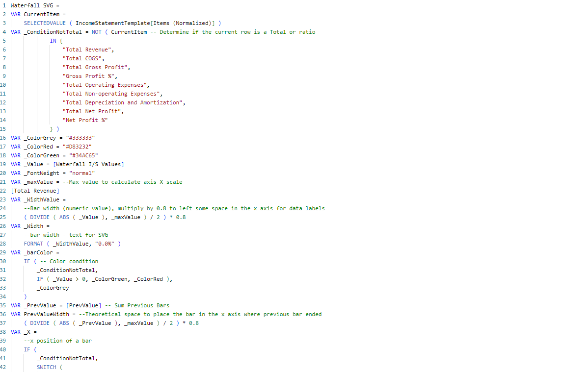
To create the SVG image, here’s the code I used:
Now, we need to render it inside of the table. So, ensure that your dataset includes the necessary information for the waterfall chart.
This typically involves having a category column (e.g., stages or time periods) and a corresponding values column (positive or negative).

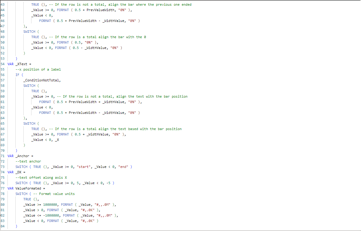
To create the waterfall table, below are screenshots of the DAX Code:
Line #35 to #53 being among the most salient lines of code, offer insight into the way that you can dynamically position the SVG images to form the waterfall structure.


Key Takeaways and Final Analysis
Waterfall tables have their place in data visualizations, offering a rapid method of consuming elaborate Financial Statements.
If you are a visually minded Finance Executive then I recommend introducing waterfall visualizations of your Financial Statements into your set of information tools to enhance your presentations, your consumption of important information and the growth of your business.


